Page 3 of 4
Re: New VGOF Logo?!?!...
Posted: Tue, 19 Apr 2011 20:10:15
by pedal_pusher
 i am aware the back image is missing the main forum name. i think it should also incorporate the forum web address but that maybe over crowding the tee. the pic is just a sample.
--
rick if/when you choose to screen-print, definitely call around. i did some things last year & you would be surprised how much more expensive a lot of places are from others. i ended up doing biz with a company in haymarket va, tirage enterprises and their prices are way lower. there is also district lines [dot] com, they allow you to upload images to design your tee (or whatever) and people buy directly from them and the profit is shared - by how much i don't know.
Re: New VGOF Logo?!?!...
Posted: Tue, 19 Apr 2011 20:14:20
by pedal_pusher
allingeneral wrote:silentshootr wrote:thanks Unkn0wN for the suggestions, after i posted earlier i found one and rescaled it.
so here's some ideas, see if you like them... looks pretty good on a shirt! also included the old image for example.
enjoy...

What's the significance of the red and tan rays of light emanating from the state seal?
rays of aww or godslight... it's just an eye-catchy design...and so it is, it caught your eye. lol. you don't approve?
Re: New VGOF Logo?!?!...
Posted: Tue, 19 Apr 2011 20:29:08
by allingeneral
silentshootr wrote:allingeneral wrote:silentshootr wrote:thanks Unkn0wN for the suggestions, after i posted earlier i found one and rescaled it.
so here's some ideas, see if you like them... looks pretty good on a shirt! also included the old image for example.
enjoy...
What's the significance of the red and tan rays of light emanating from the state seal?
rays of aww or godslight... it's just an eye-catchy design...and so it is, it caught your eye. lol. you don't approve?
Yes - eye catchy

It seems, at first glance, something from a WWII war movie (Japanese)
I like what you've done, so please don't get me wrong.

Re: New VGOF Logo?!?!...
Posted: Tue, 19 Apr 2011 20:32:00
by allingeneral
btw - here's what the first round of VGOF t-shirts looked like. Not that I want to stick with that, just tossing it in there to help your creative abilities
http://vagunforum.net/announcements/vgo ... html#p7164
Re: New VGOF Logo?!?!...
Posted: Tue, 19 Apr 2011 20:37:51
by pedal_pusher
thanks. that's a nice design, i like it. though, i don't understand the web address on the front and back. so is an ar15 a logo/design you want to stick with? i see it on most of your stuff.
Re: New VGOF Logo?!?!...
Posted: Tue, 19 Apr 2011 20:41:18
by pedal_pusher
btw.. most people i show all my designs to pick the rising sun version. it's grunge which is very 'in' right now but not at all conservative, which i'm beginning to think is your preference. is it?
Re: New VGOF Logo?!?!...
Posted: Tue, 19 Apr 2011 20:48:45
by pedal_pusher
allingeneral wrote:Yes - eye catchy
It seems, at first glance, something from a WWII war movie (Japanese)
I like what you've done, so please don't get me wrong.
It seems, at first glance, something from a WWII war movie (Japanese)"
i knew someone was gonna say that, lol. i wasn't really going for that in the design, i just wanted something to connect the eye from the va seal back to the shooter.
rick i'm definitely not taking anything wrong, i want to hear everyones opinions, suggestions, etc. don't worry, i have thick skin, you won't hurt my feelings if you don't like it. i want people to tell me/show me what they like.
Re: New VGOF Logo?!?!...
Posted: Tue, 19 Apr 2011 20:54:59
by allingeneral
silentshootr wrote:thanks. that's a nice design, i like it. though, i don't understand the web address on the front and back. so is an ar15 a logo/design you want to stick with? i see it on most of your stuff.
weeeeellllllll... I like AR-15's because they are the most recognizable, meanest of the mean
Also, the web address...that's the whole point of the shirts, really in my humble opinion...to get people to notice the gun and the link - and go there!
Re: New VGOF Logo?!?!...
Posted: Tue, 19 Apr 2011 20:57:34
by allingeneral
silentshootr wrote:btw.. most people i show all my designs to pick the rising sun version. it's grunge which is very 'in' right now but not at all conservative, which i'm beginning to think is your preference. is it?
Generally conservative - yes.
This was my second take on a shirt design.


Re: New VGOF Logo?!?!...
Posted: Tue, 19 Apr 2011 21:14:19
by allingeneral
It has come to my attention that the State Seal is the property of the Commonwealth of Virginia and that it may not be used without specific permission.
Reference:
http://www.commonwealth.virginia.gov/Of ... /seals.cfm
Re: New VGOF Logo?!?!...
Posted: Tue, 19 Apr 2011 21:16:48
by allingeneral
I just created a VGOF photo gallery of many of the images that I've worked up (ome with assistance) over the last couple of years.
http://vgof.org/photogallery.php?album_id=3
Re: New VGOF Logo?!?!...
Posted: Tue, 19 Apr 2011 21:34:33
by pedal_pusher
bummer about the va seal..who knew? i will take a look-see at your gallery. when i searched before, all i found was dk's picnic photo-stream...to bad he didn't use people's forum screen names lol.
Re: New VGOF Logo?!?!...
Posted: Tue, 19 Apr 2011 21:34:45
by wylde007
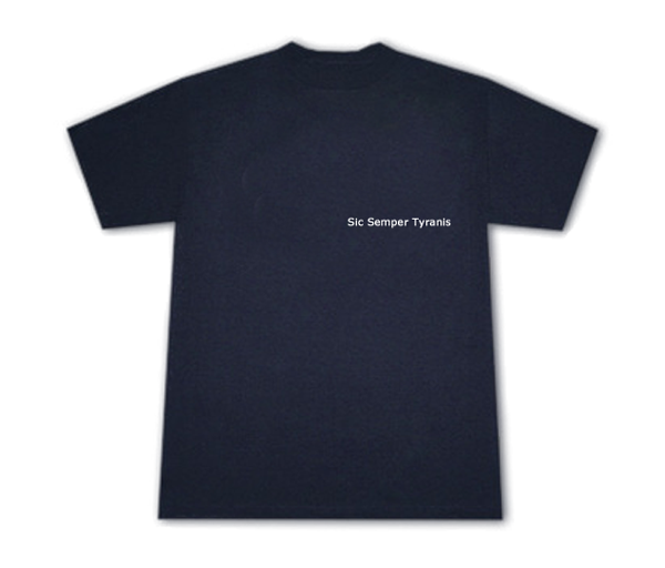
For those paying attention, just in case, "Tyrannis" has two (2) "n"s.
A couple of the examples above have only one (1).
Re: New VGOF Logo?!?!...
Posted: Tue, 19 Apr 2011 21:44:01
by allingeneral
wylde007 wrote:For those paying attention, just in case, "Tyrannis" has two (2) "n"s.
A couple of the examples above have only one (1).
Also, the guy who made some of the images in my photo gallery incorrectly spelled it "Tyrannus"
Re: New VGOF Logo?!?!...
Posted: Tue, 19 Apr 2011 22:14:40
by BlueTiki
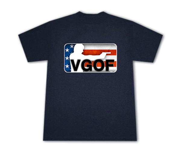
I'd like to add my two cents if you don't mind.
This image here is really good but its missing the web address.
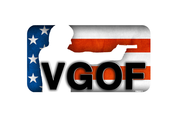
To me this image looks more complete than the image with the web address do to it having rounded corners all the way round.
The version you did that was like this but with the web address didn't have rounded corners at the bottom.
Maybe you could round the bottom corners and then add the web address. Just a thought.
By the way, if you do round the corners and add the web address, I'll be willing to pre-order at least two shirts.
Re: New VGOF Logo?!?!...
Posted: Tue, 19 Apr 2011 22:41:49
by pedal_pusher
allingeneral wrote:silentshootr wrote:thanks. that's a nice design, i like it. though, i don't understand the web address on the front and back. so is an ar15 a logo/design you want to stick with? i see it on most of your stuff.
weeeeellllllll... I like AR-15's because they are the most recognizable, meanest of the mean
Also, the web address...that's the whole point of the shirts, really in my humble opinion...to get people to notice the gun and the link - and go there!
btw i wasn't suggesting to go without the web address, i was questioning it on both the front and back of the shirt...as in, why not one or the other, not both.
Re: New VGOF Logo?!?!...
Posted: Tue, 19 Apr 2011 23:00:23
by Jakeiscrazy
silentshootr wrote:allingeneral wrote:silentshootr wrote:thanks. that's a nice design, i like it. though, i don't understand the web address on the front and back. so is an ar15 a logo/design you want to stick with? i see it on most of your stuff.
weeeeellllllll... I like AR-15's because they are the most recognizable, meanest of the mean
Also, the web address...that's the whole point of the shirts, really in my humble opinion...to get people to notice the gun and the link - and go there!
btw i wasn't suggesting to go without the web address, i was questioning it on both the front and back of the shirt...as in, why not one or the other, not both.
Max exposure, anyone talking to you and see it as well as those behind you.
Re: New VGOF Logo?!?!...
Posted: Wed, 20 Apr 2011 00:49:08
by pedal_pusher
what do you guys think of this for the front? once i get the shading right, it will pop! i think that's tight.

Re: New VGOF Logo?!?!...
Posted: Wed, 20 Apr 2011 01:11:12
by pedal_pusher
so the above for the front, and either of these for the back. not sure if you guys are grooving on the aged look, sorta civil war like, which i think is cool. speak up and let me know if i'm going in the wrong direction and you prefer the nba logo more (the original design). either way i think this new front with the guns is wicked.
so front:
back:


Re: New VGOF Logo?!?!...
Posted: Wed, 20 Apr 2011 05:52:30
by graybeard321
silentshootr wrote:helpful to see it posted,... i did this version to showcase VGOF better.
My wife and I both like this one.